Bank website
A website redesign for approaching a new audience
- User interviews
- Competitive analysis
- Style guide
- Wireframing
- User-interface design
- Prototyping
Role
UX-UI Designer
The project happened inside Giro54, a UX agency
Field: Bank, Website
Jul 2020 – Oct 2020
La Paz, Bolivia
Some of the details (like branding) have been changed to respect the company’s privacy
Overview
BMSC is a very important brand locally, beginning in 1905, it is one of the oldest banks in Bolivia. But, like most financial entities, always relied on face-to-face customer experience. BMSC’s workers have been recognized and awarded as the most helpful and efficient several times, but the online experience has never been strong enough to compare. And then the pandemic arrived.
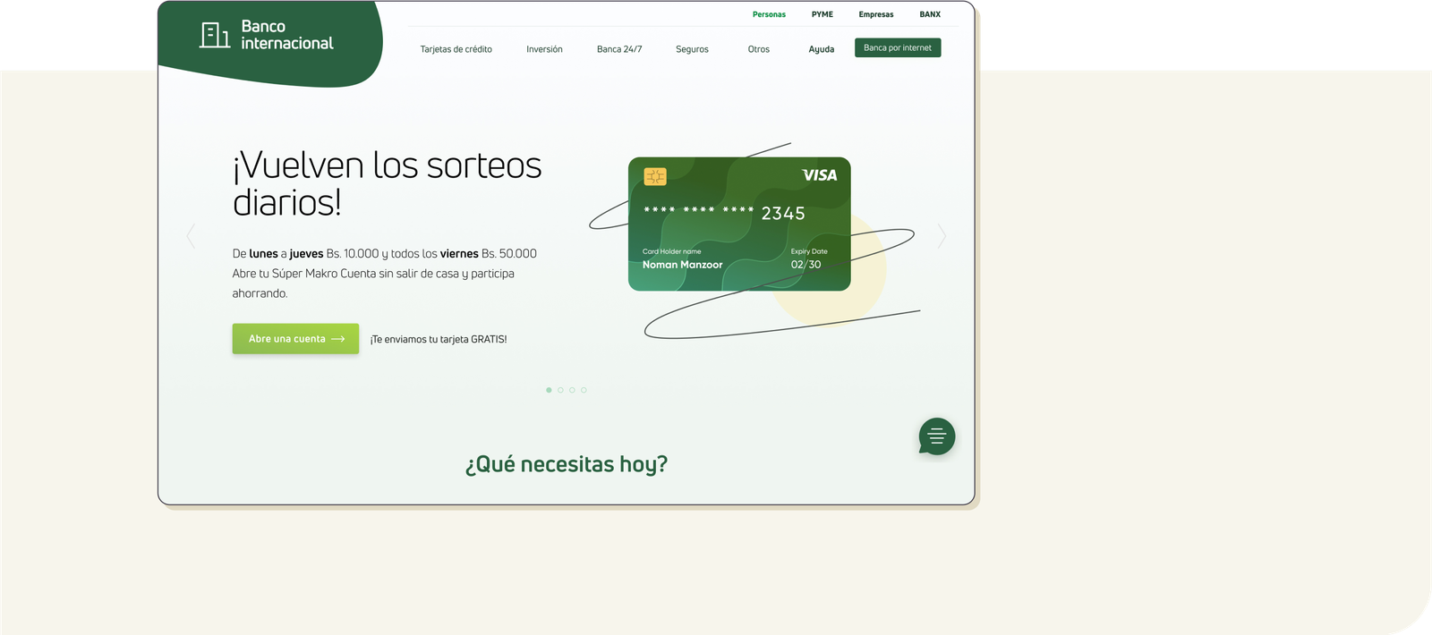
How might we present complex information about financial services in a way that makes the user feel safe and informed to take action?
About
Understanding the problem
Besides the pandemic and the client’s rush to provide current and potential customers a better online experience “due yesterday”*, the challenge was to reflect the bank’s solid personality and trajectory in a friendly and modern way to a younger audience.
The data collected by the bank over some time showed us that it’s mostly the younger users that get information online and browse for services, but most end up choosing other banks.
*Research, ideation, designing/prototyping, and testing took less than 3 months.
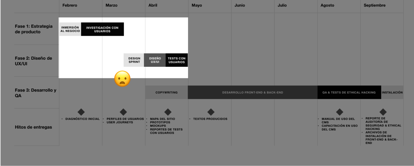
The task
The current website was failing in many ways, as we discovered in the user interview phase described later, displaying cluttered and difficult to understand information, with unclear CTAs, in a very old-fashioned look and feel.
Some things the bank was asking for:
Launch a website that can provide all the information about their services to current and potential customers in a friendly way.
Design a new look and feel for the website, showing a modern and straightforward personality that stands out from the competition.

Some screens of the old website
Research
Interviews
The bank provided us with some basic information: the age range and characteristics of users who mostly use their online tools, also the segment they were focused on attracting.
We conducted interviews with 20 current and potential customers, with them we learned about their past experiences and habits when looking for a financial service, also feelings about the current website and the bank itself.
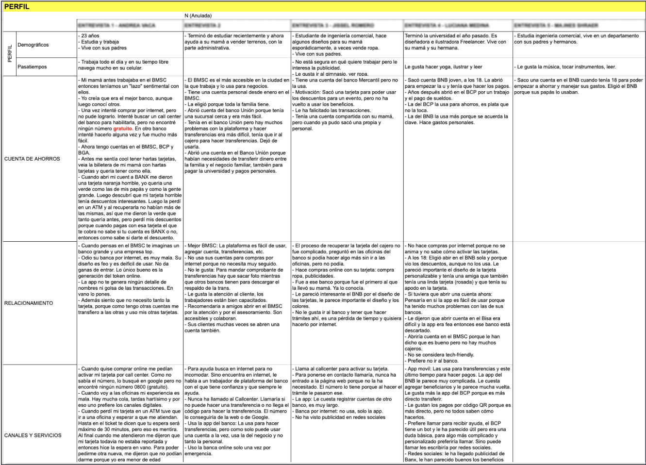
Notes from the interviews.
With the interviews we were able to:
#1
Identify the user’s pain points when searching for information and choosing a financial service.
#2
Learn why the current website did not meet user needs, we found four main reasons:
- Lots of financial jargon and difficult words; this was critical because instead of forcing users to learn more or go to an agency, it often made them wonder if they were knowledgeable enough for that service.
- The navigation (menu and sub-menus) was enormous and confusing.
- If the user decided to start using a service, CTAs were not clear and all worked in different ways.
- Young users felt that the overall style was “old-fashioned” and that the bank didn’t consider them as customers.
Users
Our main user is young people between 25 to 35 who need a financial service. We build our Main persona with traits and quotes taken from the interviews.
During the interviews, we also learned that most 35+ people do not completely trust getting these services online and prefer in-person paperwork, but they occasionally use the tools to get information before going to an agency, so we considered them as secondary users.
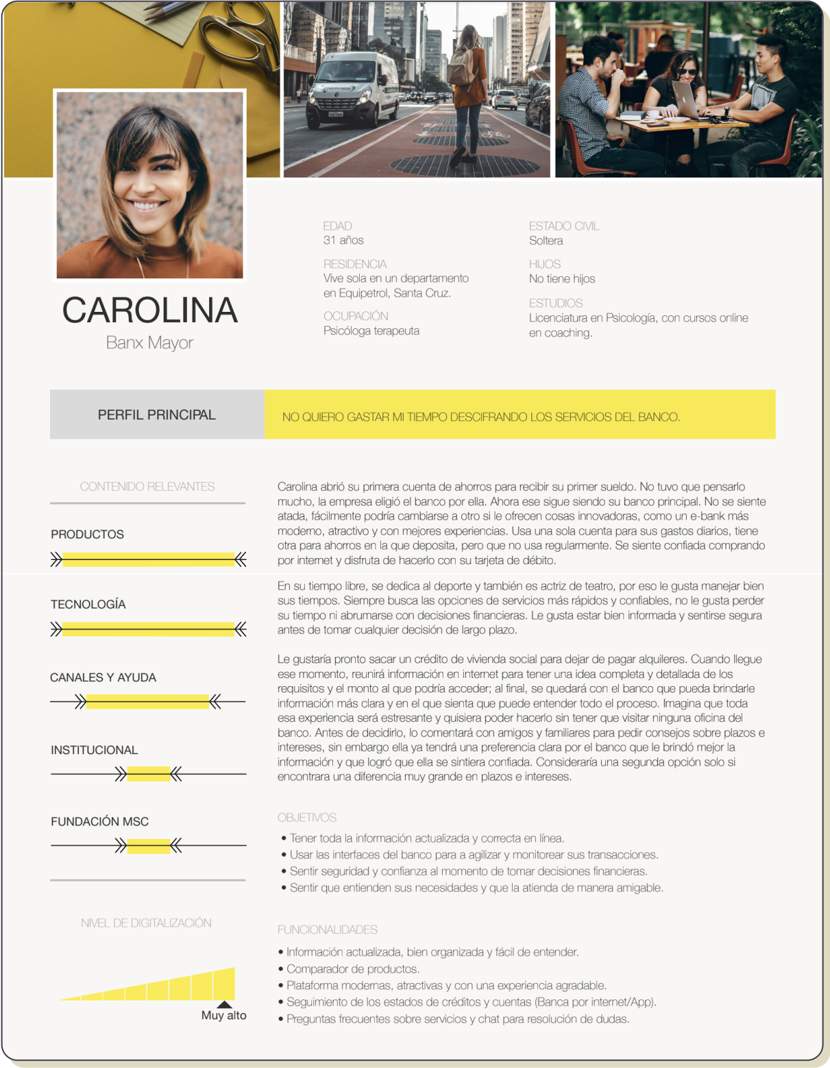
This is our Primary user.
Benchmark
How are other banks dealing with our issues?
The competitive analysis showed us that no other local bank provides information easily and directly, in all cases it’s necessary to understand financial terms.
Also, style decisions do not reflect a defined personality but rather generic, trying to target all audiences and show all the information at the same time.
The solutions
Taking learnings from the Design Sprint, we ran some mini-sessions to ideate, look for inspiration, draw ideas, and vote on a solution for the structure and layout for a homepage to later prototype.
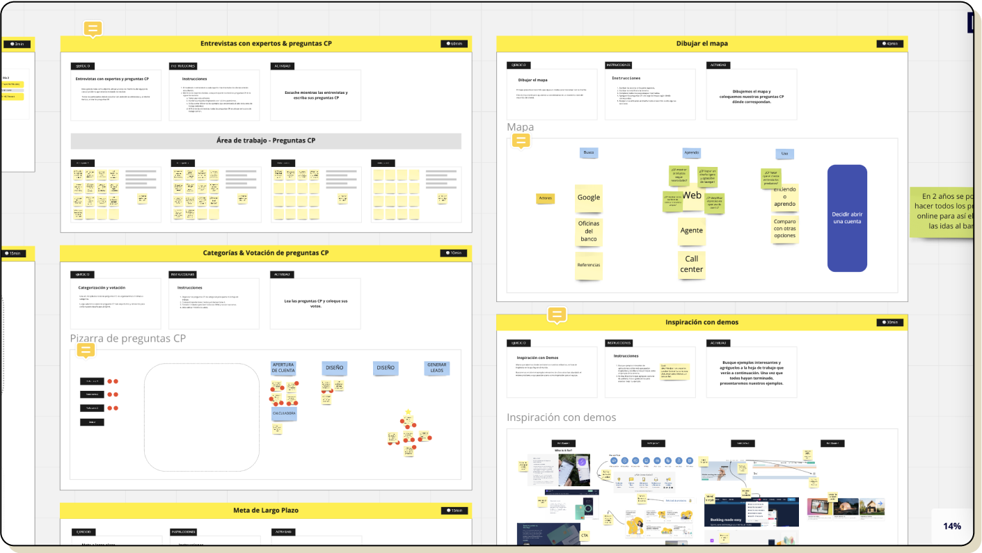
Remote mini-sessions in Miro
Winner solution: Easy finance
In these mini-sessions, we defined that we would focus on making the complex financial content more understandable, approaching the user by speaking their language.
To make this happen we needed to work with at least one UX writer, but we had no luck finding one in Bolivia, so we decided to UX-train an advertising copywriter and together we worked on simplifying and restructuring the content.
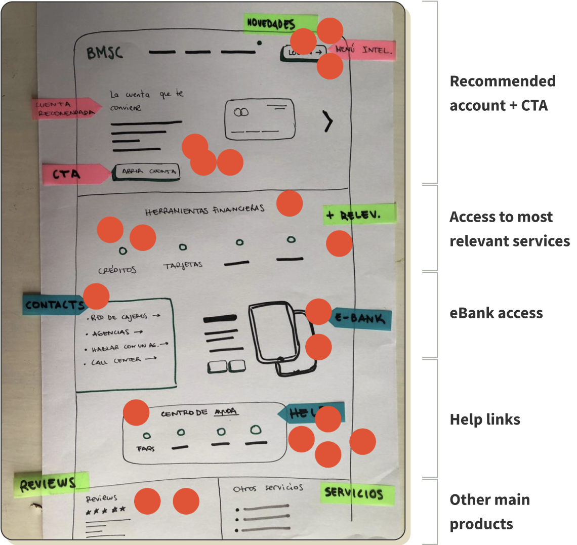
This is how the winner solution looks after design.
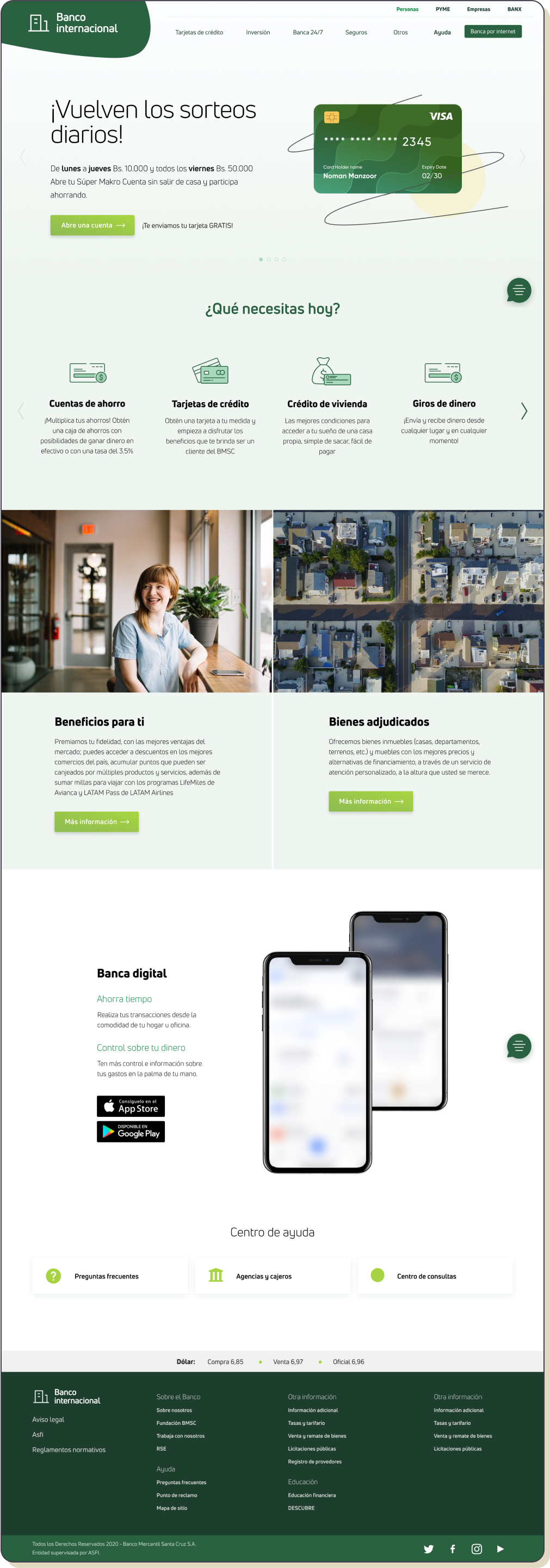
Sitemap and navigation
To simplify the navigation we eliminated the previous grouping by concepts that only made sense to bank staff, instead, we decided to show services grouped by categories defined by the needs of users.
Final designs
Presenting and describing a product
Here are some highlights:
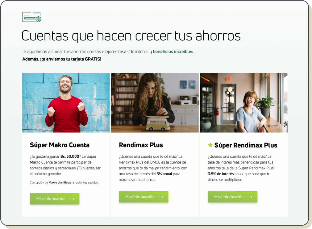
List of options with mini-description of what each product is and who is it for.
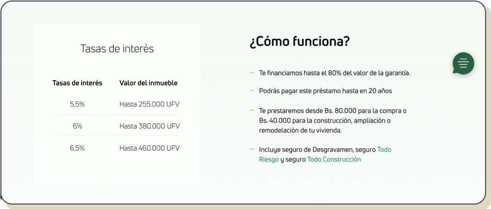
“How does this product works?” for the content on the product page.
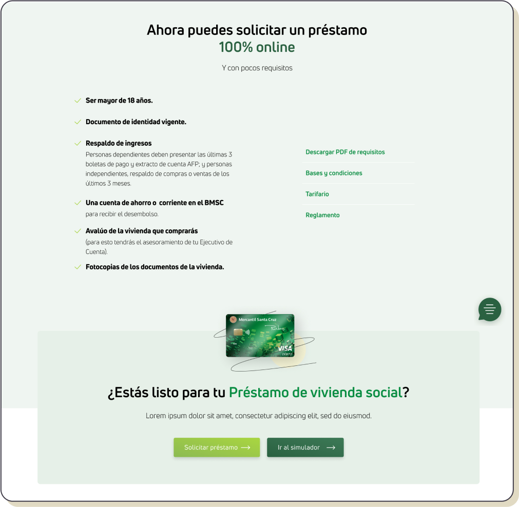
List of requirements to access the product, links to Terms and conditions, fees, statements.
Call to action to start using the service immediately or to try a simulator.
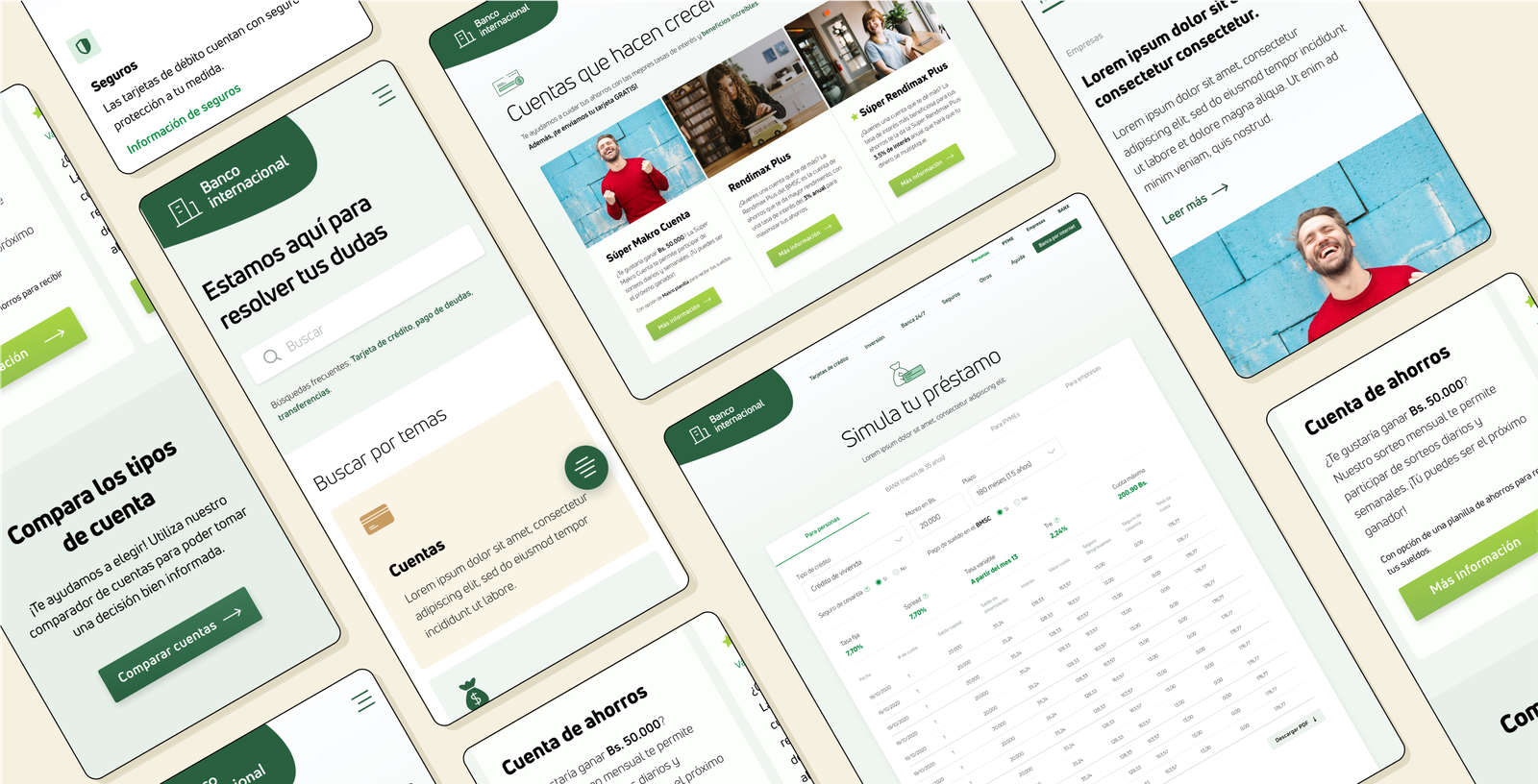
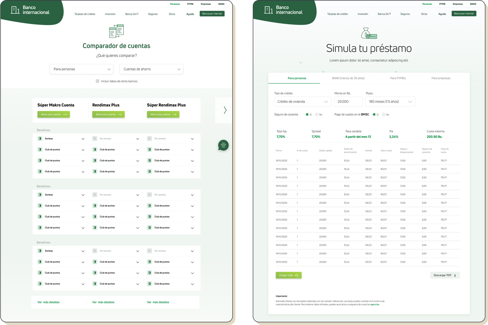
Helping the user choose a service
We used tables to compare the services and help users understand the differences between them and build confidence to make decisions.
Help resources
Like FAQs, call-center numbers, a blog for information about financial regulations, and general tips.

Learnings & results
Speaking the user’s language
Speaking the user’s language was crucial for helping them really learn about the services and choose the best one for them. I learned to value the contribution of those who work on content. We learned that no other local financial institution had put an effort into speaking the same language as the user, so it felt really good to take the lead!
We accomplished great testing scores
After design and prototype, my colleagues conducted user testing with 10 participants, the results showed that participants were able to perform 81% of all tasks and the feedback and perception of the website were very positive. From there on we were able to work on improvements and iterations before handing the final designs off to developers.
iZi, a SaaS solution

Description of the product category