iZi
A business to help other businesses
- Branding
- User definition
- Service blueprint
- Design system
- Wireframes/prototypes
- User testing
- Dev collaboration
- Iterations
Role
Lead Designer
Field: Startup, SaaS, B2B
Jun 2018 – Jun 2022
La Paz, Bolivia

Overview
iZi is a Bolivian Startup that offers a SaaS solution to help businesses of all sizes manage and digitalize their processes.
The startup was born when the co-founders wanted to set up a new business and became aware of the aches and pains of dealing with the tax system. This turned into a new business idea: an app to manage taxes in a user-friendly way.
After some time and 2 rounds of investment, iZi is becoming a well-rounded business tool, now offering solutions for sales and invoicing, product inventory, payment gateways, stats, and more.
Understanding the problem
The problem was very visible, the dislike for the Bolivian tax system’s software is very public. It is very hard to use, with very poor aesthetics, with too much information and little feedback resulting in errors that mean huge fines or businesses being shut down, and therefore… dislike.
Our goals
The processes can’t be changed but how they are displayed to users can be improved. We wanted to:
Help businesses avoid fines by providing a tool to register taxes correctly, with better descriptions, feedback, and notifications.
Help entrepreneurs avoid mental breakdown by dividing the processes into smaller/clear steps, softer aesthetics, and friendly interactions.
My role
I started as a UI Designer, hired to create some screens the co-founders had already planned.
Together and early on, we were able to spot a lot of failures with the original idea and that gave me the opportunity to re-think the app using UX processes.
With a lot of pressure from early investors, the team managed an MVP, so ready or not we went. From there on, we were able to validate ideas in the real world, hear what early users had to say, and improve a lot.
So this project is a lot about re-design, reviews, and iterations.
But first, a logo
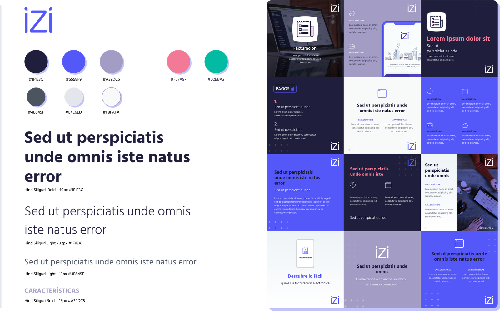
A little help with the brand
We needed a brand and colors to start, also the marketing team was in a hurry to start creating material.
I worked on a brand and some design guidelines to help define style and personality.
Website
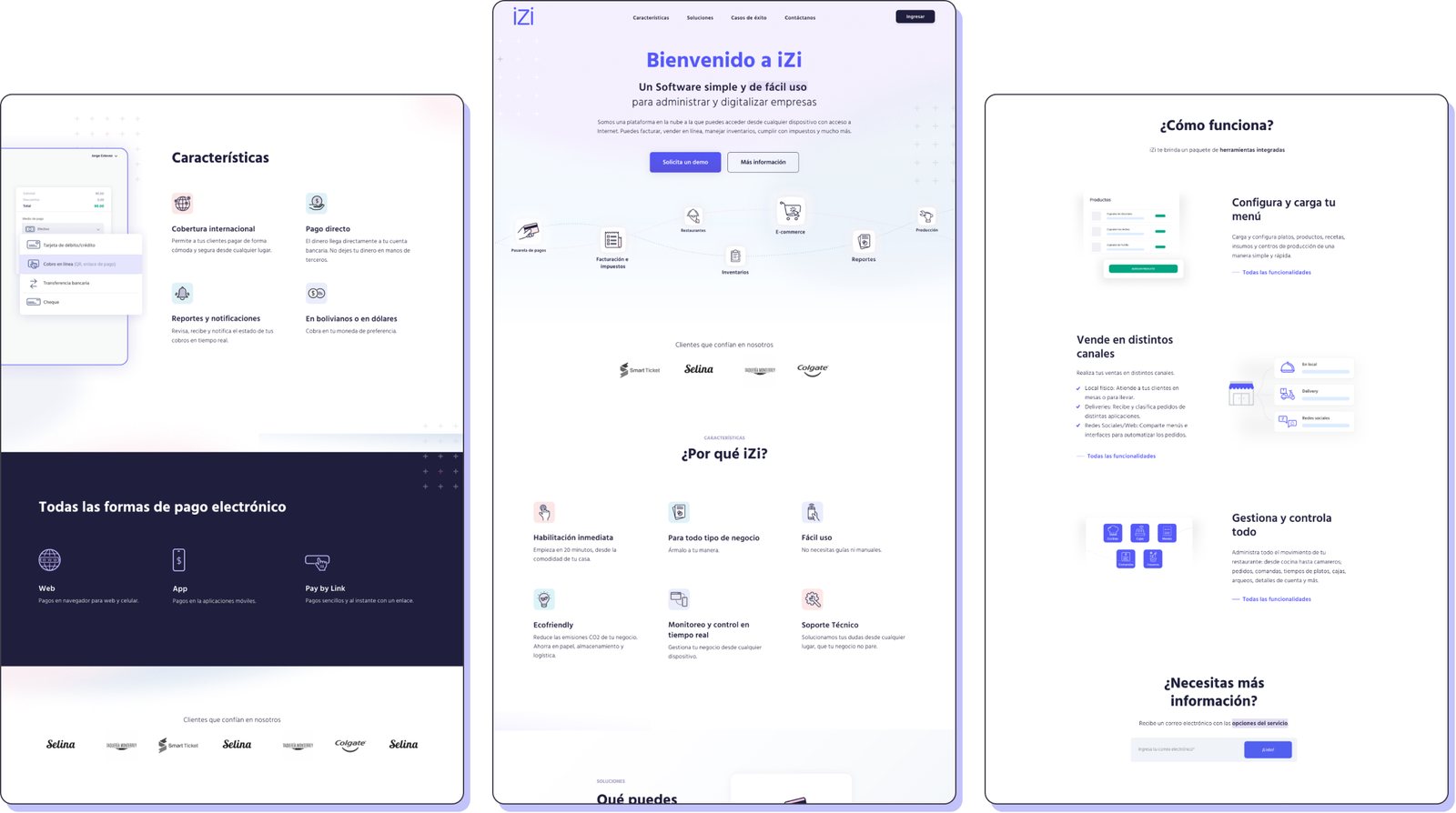
We planned for a website early on so that the sales team could have a tool to display the services and information, capture leads, and track audiences.
I worked on the design/creation of the website and after many versions (and pivots), today we have a website that we really like and that it’s proving to be a very useful sales tool.
Back to the app
Users
From early on, I had access to what users were saying, with this information we spent a lot of time fixing and improving what we already had to fit them better.
Our biggest finding was that most were looking for a single software (a one-stop-shop) to do more than tax management, they asked for invoicing, inventory, stats, and other features to easily run their businesses.
Over time we’ve been adding and creating new services, and our main user is now very broad, today being any person running a business in the country and in need to digitalize their processes.
To improve team alignment and objective setting we are focusing on these three main users:
User #1
Small and medium business owners.
User #2
Small restaurant or coffee shop workers.
User #3
Online-store owners.
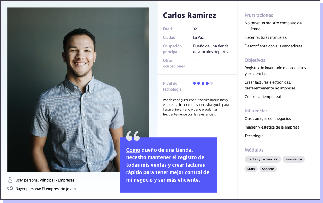
This is our medium business owner Persona (he is also a Buyer Persona)
Product planning
Through the project I kept close contact with the CTO, working together to plan the product and its improvements, trying to document processes as much as possible, and keeping our teams aligned.
Our sitemap is a great tool to understand the product and services, how they interact, and which are dependent on others.
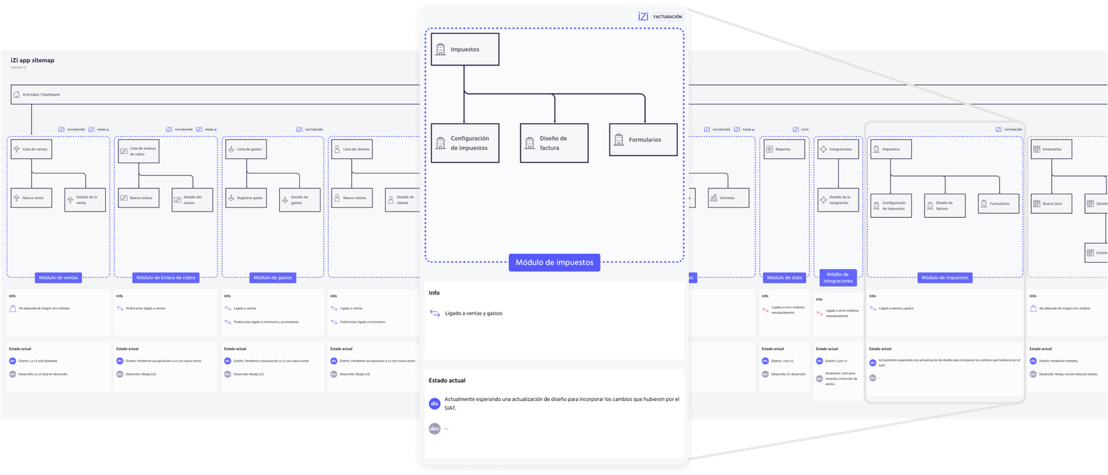
Journey and Service mapping
As the app grew bigger, also did the need for proper documentation of our services, not only with wireframes like we were doing but with something easier to read for everyone and easier to update.
Through mapping workshops, the design team has been creating service blueprints for all our solutions. We also use these mapping techniques to plan new features. Maps are then translated into design tasks which helps a lot with the design team organization.
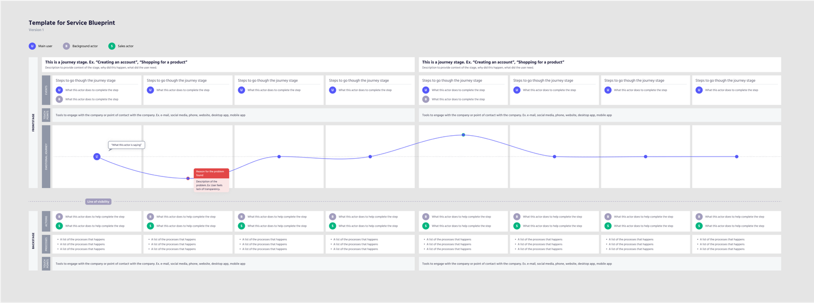
This is a Service Blueprint template I made for iZi while taking the Journey Mapping course from IDF.
Gathering data
With time, we were able to add more information to the maps, like customer satisfaction for the cases where we could run surveys or get this information by talking to customer support to find out where users were having trouble.
These maps help us stay aligned and informed, also to visualize future improvements and other design tasks.
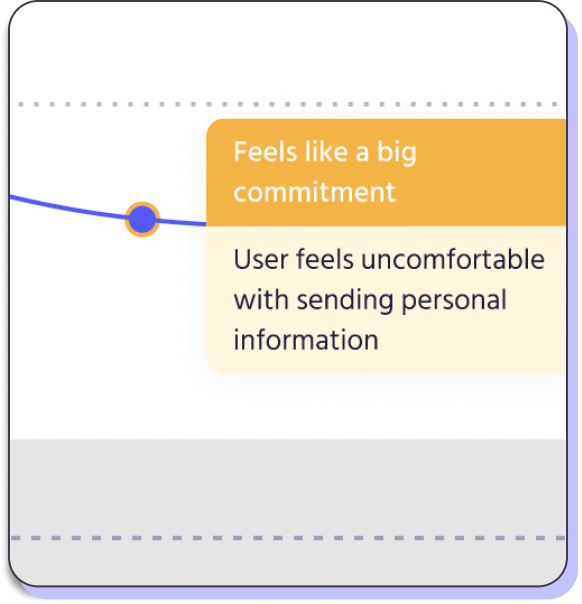
Documentation of users’ pain points helps us organize and prioritize improvements.
Design System
As more designers joined, we needed to make sure everyone was using the same components and templates, there I found atomic design and it was just what we needed, so we started to work on our Design System.
The DS is helping a lot with maintaining consistency, working with naming conventions, and making the design process more agile. It also improved our collaboration and communication with front-end devs.
Our design system lives in Figma and it’s working really good for us.
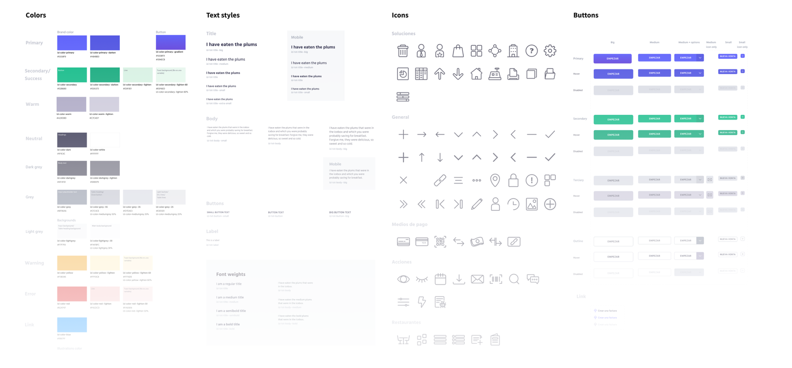
The solution
Some highlights from the Taxes solution:
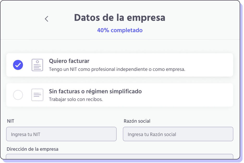
Divided steps and progress indicator
We couldn’t get rid of all difficult decisions, but at least they were well explained and prettier.
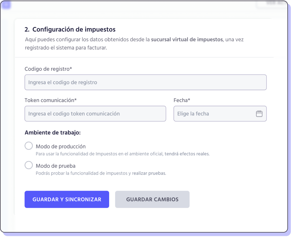
Short but precise context about what the user should do in every step.
Extra descriptions for difficult to understand mandatory fields.

Awesome and clear warnings
Some Wireframes
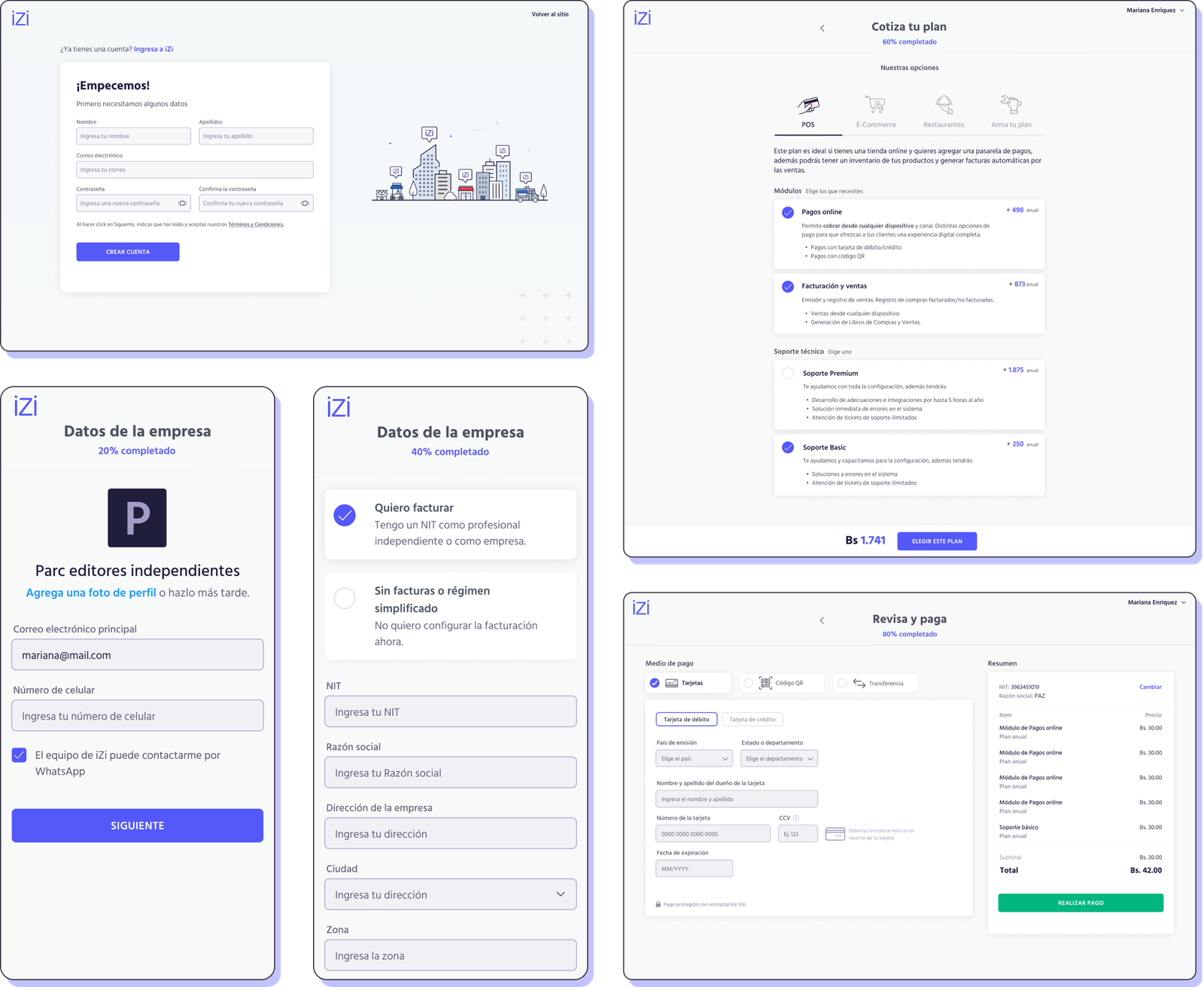
Onboarding process
Getting users’ information about their business in a way that feels clear and friendly, trustworthy too because it ends with a payment and a one-year commitment!
Templates
Lists, filters, detail pages, actions, new item page, edit item page, etc. When thinking of a SaaS, there are a lot of templates that will be repeated and used (a lot). These are some of our templates.

POS, Business Stats, and more
Point of sale processes, data visualization, client management, promotions, payment, and invoicing.

And of course
Testing, testing, testing
We use testings in two different levels:
#1
Constant internal validation
with co-workers to spot basic interaction issues. I love this type of testing because it helps us see our ideas being used by a human and reveals a lot of basic interaction problems at a very low cost and time.
#2
Traditional testings
by gathering users and asking them to complete tasks on a prototype, with me moderating and the team taking notes. We don’t do this as often as we’d like, but when we do, it’s very useful for validating new ideas and choosing between options.
Learnings & results
How are things going
We reached our goal to have a solution to manage taxes in an easy and friendly way. We are integrated with the Nacional tax system and have a platform that keeps users informed about due dates and taxes payments, to avoid fines. Having this ready, the team feels comfortable creating more features and trying new things.
Working on a new product
Being part of a project from the beginning stages allows for a better understanding of the business. Learning from failures and being able to participate in iterations gives a great understanding of the product and the users.
Not the ideal Ux process
At first, I felt guilty for not being able to start my work with thoughtful research and a lot of data. Now I’m starting to see that every project can have a different process and that the product can still be successful. Also, it’s never too late to do some research.
Parc libros, an indie publisher
I worked with WordPress so the content is very easy to update by anyone.