Main contributions
- Product ideation
- Design/prototype
- Design system
- Stakeholder management
- Iterations
Role
Senior UI/UX designer
July 2022 – May 2024
Disclaimer: The final client’s name and identity have been changed to protect confidentiality, as the project has not yet been launched.
About the journey planner
Web-based, mobile-first journey planner designed to enhance the travel experience for airport passengers. Built to address the common pain points faced by travelers, provides a seamless way to plan timings, activities, shopping, and dining at airports.
Problem Space
Airport apps traditionally suffer from low installation rates and usage.
Airports want to offer more ways for the passengers to plan their time at the airport.
We wanted to offer airports a solution that passengers would actually use. For a proof of concept, we leveraged existing data from our other product, an Online Travel Agency, and our strong relationships with airports to understand the market needs. The goal was to create a tool that passengers could use on the day of travel to navigate airports efficiently.
Ideation and Implementation
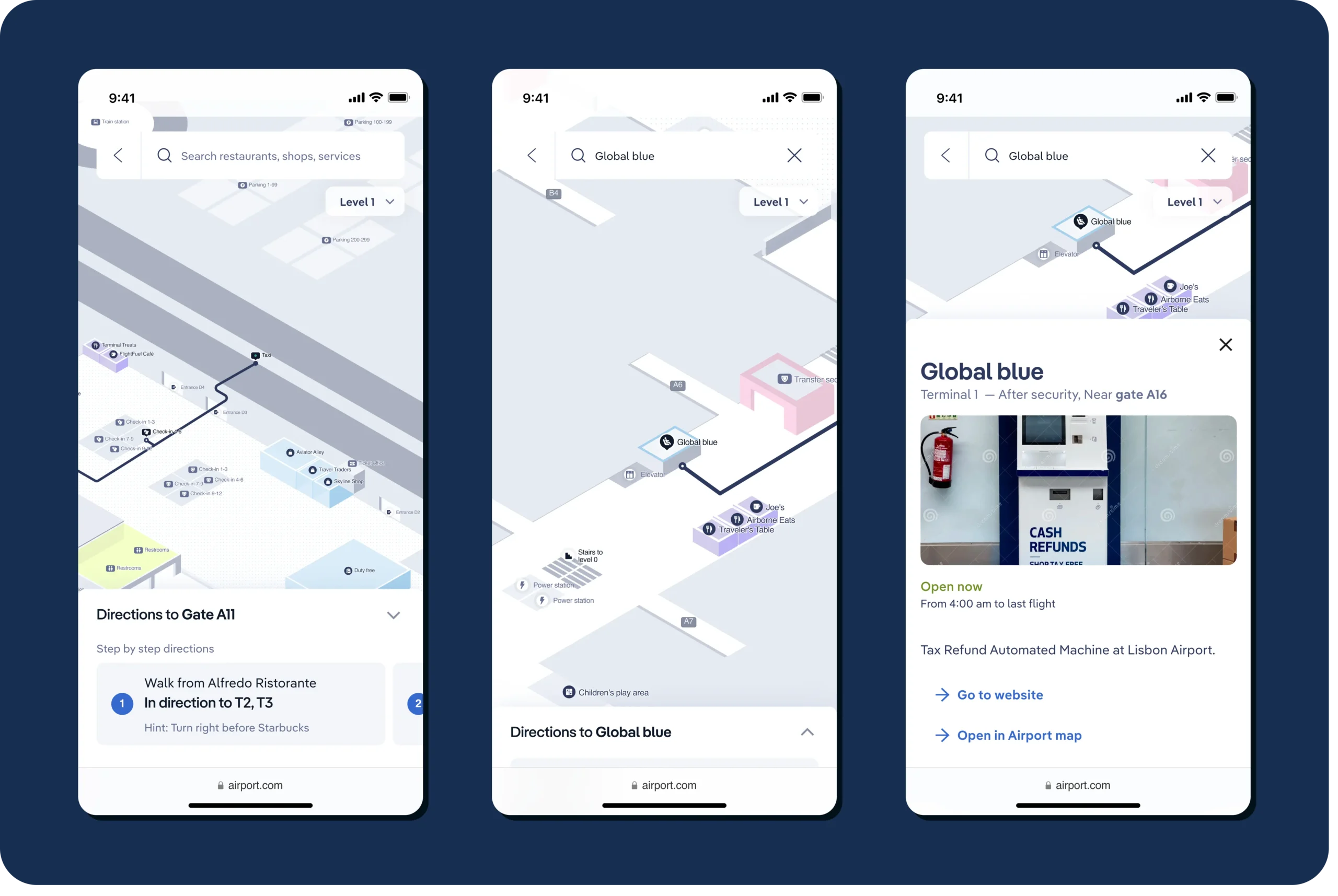
Starting with a solid foundation, we decided to focus heavily on the maps of airports—an extensive asset the team had developed during the pandemic and that we were eager to put to good use.
The initial design revolved around a journey planner that directed users to the airport map for navigation and instructions.
The main idea: passengers can easily locate themselves, find airline counters, security areas, and gates, follow a certain route with instructions, and easily navigate through the airport.

The idea sounded promising and prototypes were well-received by our clients. However, the implementation phase revealed significant issues. The real-time location feature (blue dot) was inaccurate, leading to confusion among users.
First users, Learnings, and Iterations
Our first users were the company’s and the client’s employees, and their feedback was crucial:
The inaccurate blue dot feature highlighted the need for a more reliable instruction system.
We quickly pivoted from a map-based solution to one that provided passengers with literal step-by-step instructions for navigating the airport.
Competitive analysis
To keep our solution innovative and aligned with industry standards, we continuously reviewed and compared how other airports addressed travel planning challenges. This ongoing analysis helped us stay updated on industry trends, identify key opportunities, and prioritize the most valuable features.
Our approach:

Our extra: collecting passenger preferences
Additionally, we incorporated user preferences collected through an onboarding process, allowing us to present tailored services and relevant options for a more personalized experience.
We also partnered with technology providers to offer live updates on crucial travel information, such as security queue times and correct entrances based on flight details.

Design system and White Labeling
The final step was creating a design system allowing easy customization. Many interested airports wanted to adapt the product to match their digital brand guidelines, including fonts, colors, and other graphical elements.
I designed a versatile design system that worked for our base no-brand Journey planner and could be easily tailored for white-label solutions. This flexibility ensured that each airport could offer its passengers a branded, cohesive experience.

Overall learnings and results
Stakeholders
Recurring stakeholder meetings with our trusted airport partners were invaluable. Their input during these sessions was crucial in refining the product and making the Journey Planner more effective, based on their needs.
Ideating new products
Working on new products is always an exciting challenge, especially when it involves helping companies turn their ideas into reality. There’s something incredibly rewarding about fulfilling a company’s vision and watching it evolve into something tangible and impactful.