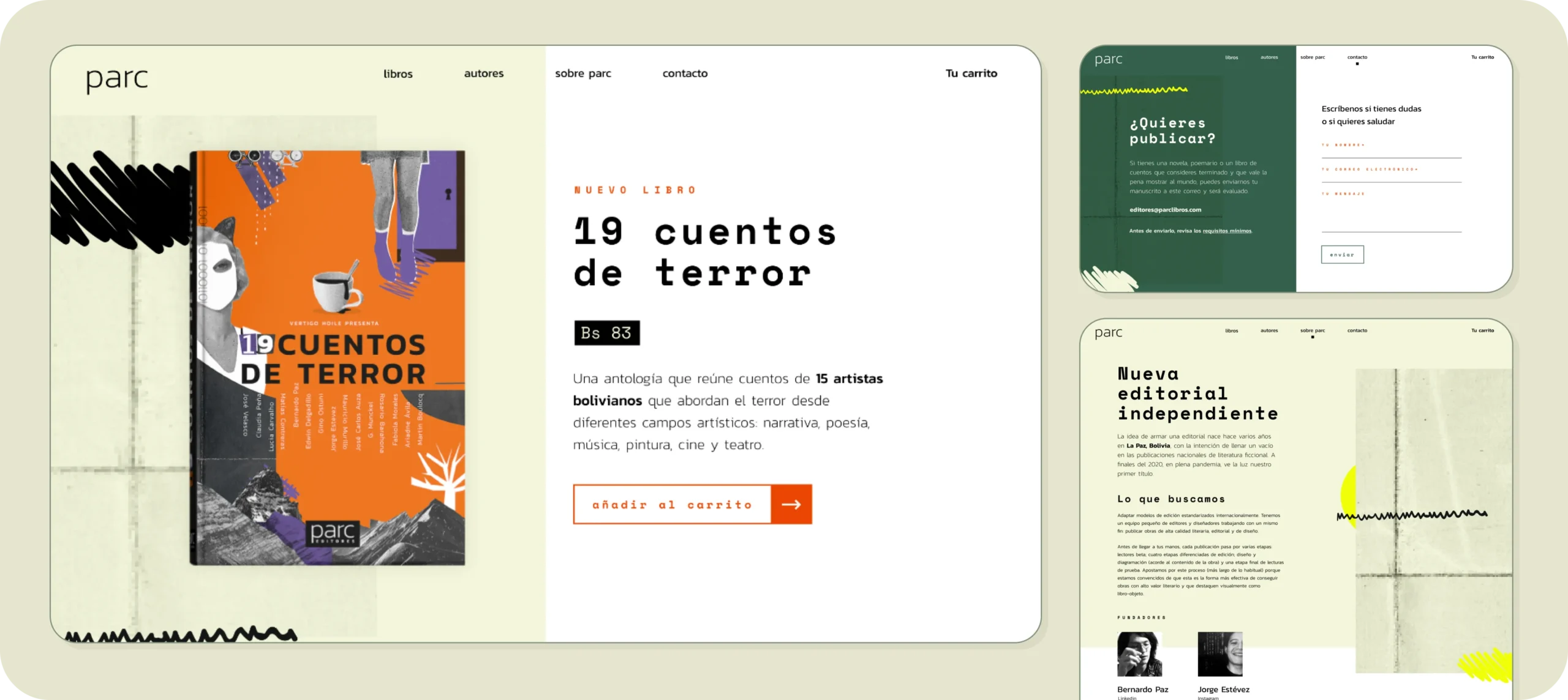
Main contributions
- Branding
- Style guide
- Book design
- Design & prototype
- E-Commerce development
Role
Product designer
2021
About the publisher, parc
Parc is an independent publisher, borned during the pandemic when two fellow writers/editors recognized the lack of small publishers with a modern, digital approach.
One to provide a platform for emerging writers, enabling them to publish in short runs, utilizing digital tools for promotion and online sales, all while upholding high-quality editing and book design.
I was privileged to contribute to the inception, ideation, and design of our initial products.
Problem
In Bolivia, the book industry has always faced challenges. In 2020, issues became more apparent:
Local publishers have little interest in adopting technology or digital tools for online sales, book presentations, promotion or just having a good digital presence.
For new writers, printing in low runs is practical, but limited resources hinder hiring designers. This results in visually generic and harder to sell books.
Goals
Parc aspires to establish itself as a small yet impactful publisher, with a strong digital presence.
Provide online platforms for browsing and purchasing books, dedicated spaces for book launches and calls for emerging writers.
The plan

Branding
The publishers named the business quickly and we needed a brand to go out into the world. After some talks, I was able to understand the personality of the publisher (and of the editors):
Daring / futuristic / digital.
I started working on the brand and a first style guide to use in the following steps.
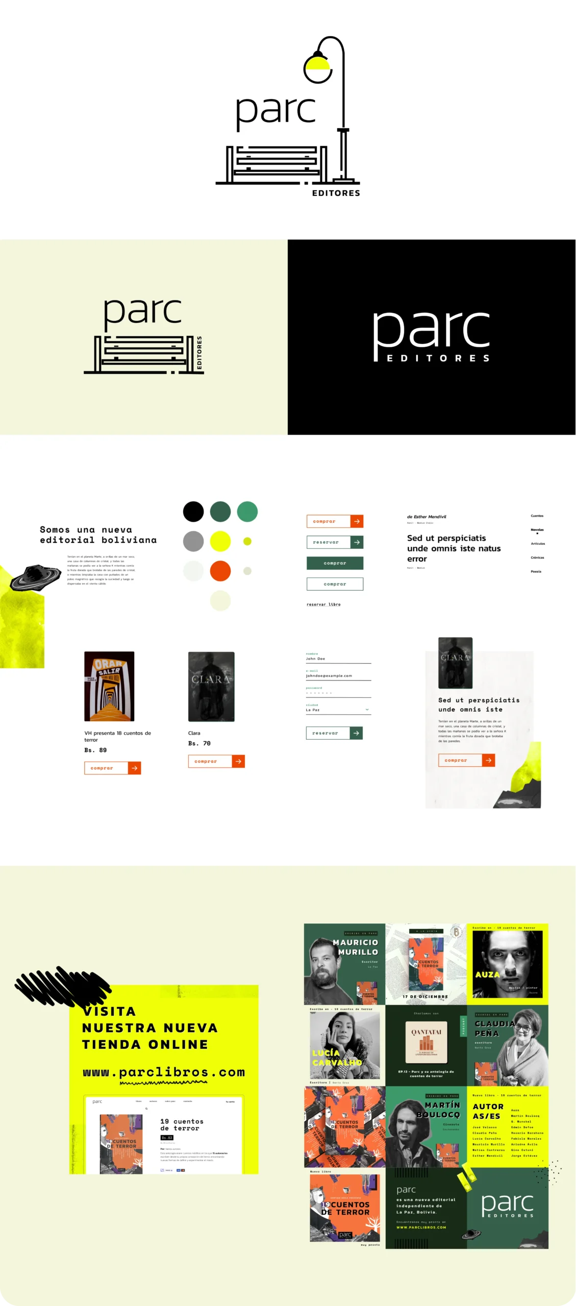
The first book
For the debut publication, the editors chose a book featuring horror stories by 15 authors. These were artists from various backgrounds and cities, creating a captivating collection designed to appeal to a broad audience.
The terror genre was ideal to showcase the daring personality of parc

Consistency
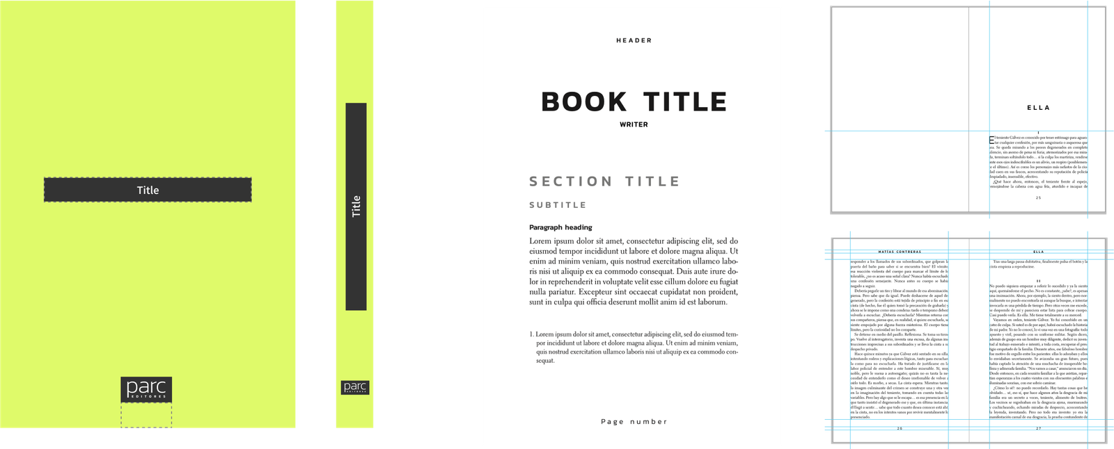
Part of my work was to ensure that the layout and design quality of the books remain consistent. I created a simple layout and design guide to be used in this and subsequent publications.
This allows for hiring less experienced designers or having non-designer people working on book design.
Online-store: Ideation
During collaborative ideation sessions with the entire team, we explored and deliberated on various approaches. Two notable ideas emerged:
Bookstore: Aiming to show products and sell books.
(And the winner) the informative platform: Using the website as a tool to inform about the publisher’s processes and philosophy (while also selling books)
Site 1: The salesman
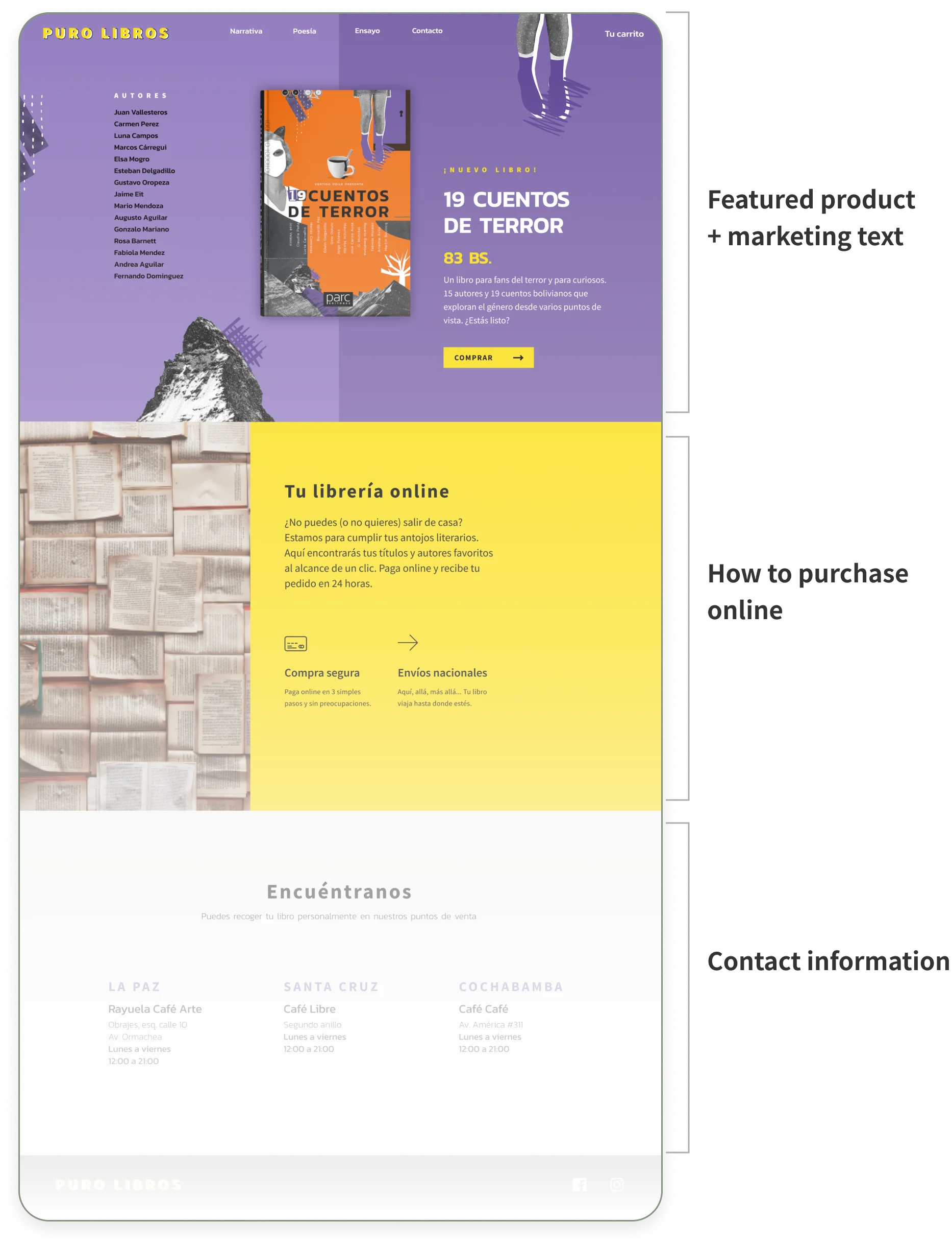
Site 2: The idealist

Content and structure
It was easy for the editors to write content for the website, which was later reviewed to make it shorter and friendlier.
I created a structure for the content to everyone to agree before going to design and development.
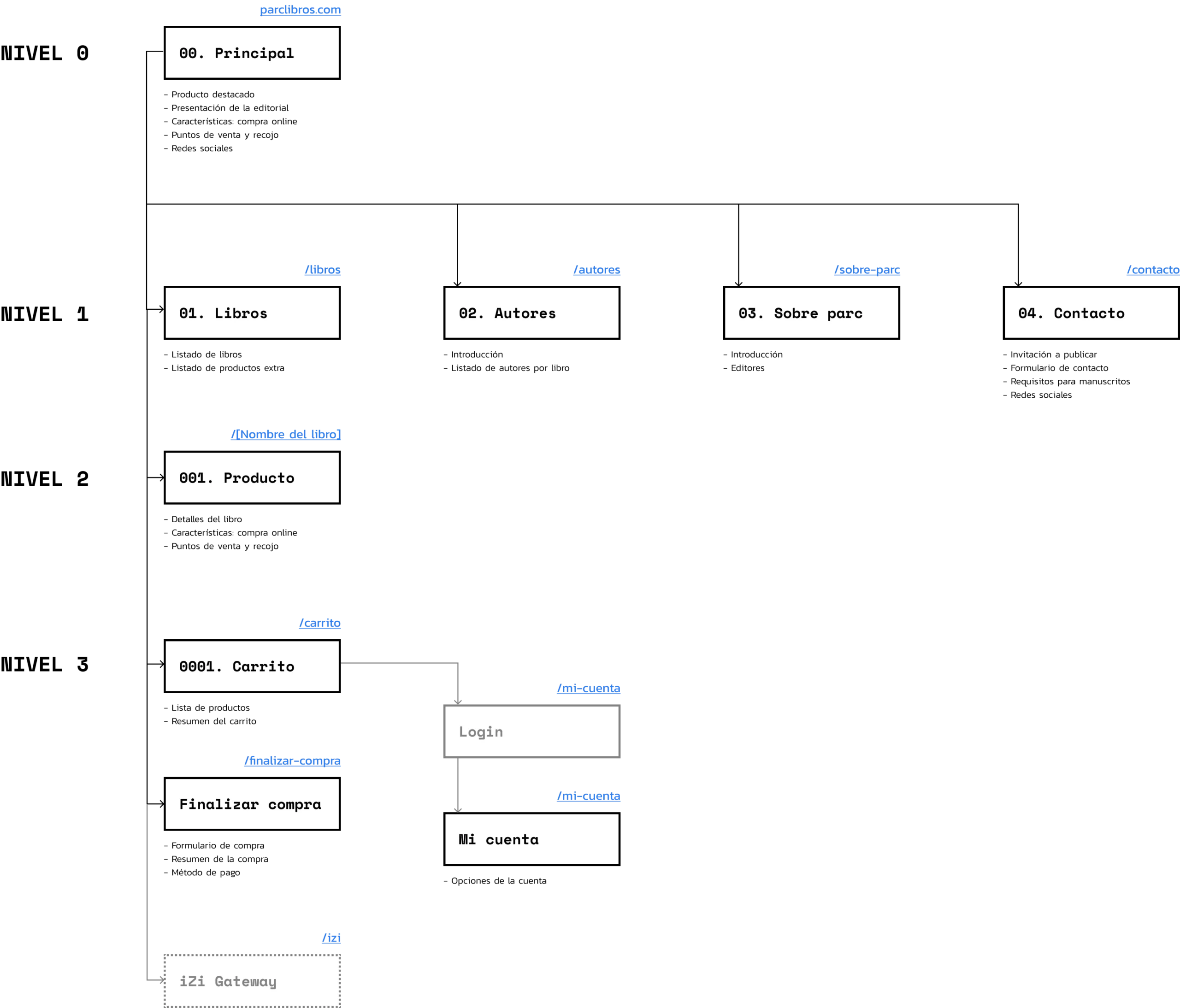
Content structure:
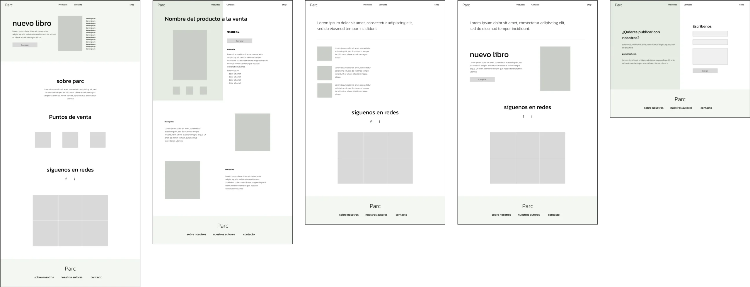
Final designs
Then I was able to design high-fidelity wireframes for the rest of the site. And a few weeks later, we had our store up and running (thanks to WordPress and lots of CSS).


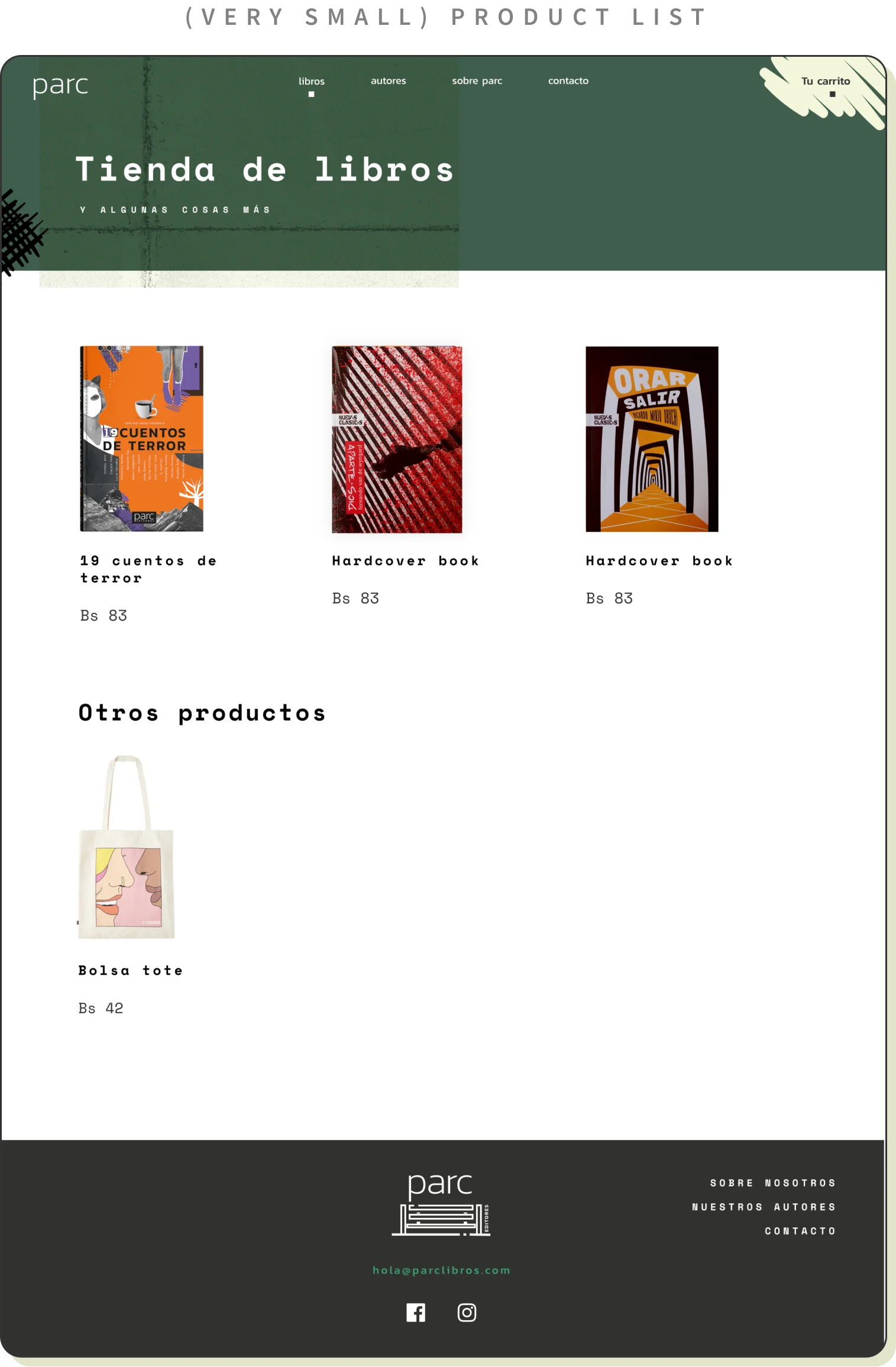

Overall learnings and results
The visual identity of a book publisher and the design of the book play a big part in whether someone decides to buy it. We’ve been getting some great feedback on the designs and website, and new writers have been reaching out because they want that polished editing, a nice cover, and a solid online presence.
Although we are in an environment reluctant to buy online, there are some who’d give it a shot if the whole process feels reliable and smooth.