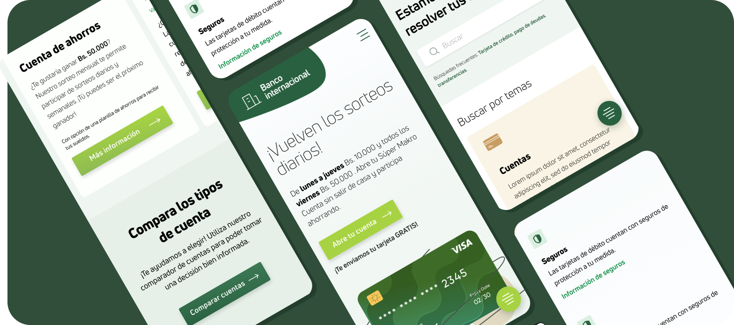
Main contributions
- User interviews
- Competitive analysis
- Style guide
- Wireframing
- UI Design
- Prototyping
Role
Senior UX/UI designer
June 2020
Disclaimer: Part of the client’s identity has been changed to comply with confidentiality agreements.
About this bank
BMSC holds a significant local presence, tracing its roots back to 1905, making it one of the oldest banks in Bolivia. Historically, it has thrived on delivering exceptional in-person customer experiences.
BMSC’s employees consistently acknowledged and awarded for their helpfulness and efficiency, however…
the online experience has never quite matched this reputation.
The onset of the pandemic has underscored the need for a robust digital presence.
Understanding why
The pandemic and the client’s urgency to enhance the online experience prompted our challenge: modernizing the bank’s image for a younger audience while preserving its solid reputation. Bank data revealed that although younger users seek information online, they often choose other banks.
Interviews
The bank shared essential details, including the age group and traits of primary users utilizing their online tools and the targeted segment.
Through interviews with 20 current and potential customers, we gained insights into their past experiences, search habits for financial services, and sentiments regarding the current website and the bank overall.
Notes from the interviews.
With the interviews we were able to:
Identify user pain points in information search and financial service selection.
Identify why the current website fell short, pinpointing four key issues:
- Abundance of financial jargon and complex texts, creating uncertainty among users about their knowledge suitability for the services.
- Extensive and confusing navigation, large menus and sub-menus.
- Lack of clarity in Calls to Action, with inconsistent functionality.
- Perception of an “old-fashioned” style by younger users, feeling overlooked as potential customers.
Design work
After the interview findings the stakeholders decided to primarily focus on this tasks:
Launch a user-friendly website with comprehensive service information for current and potential customers.
Redesign the website with a modern and distinctive personality to stand out from the competition.
Defining users
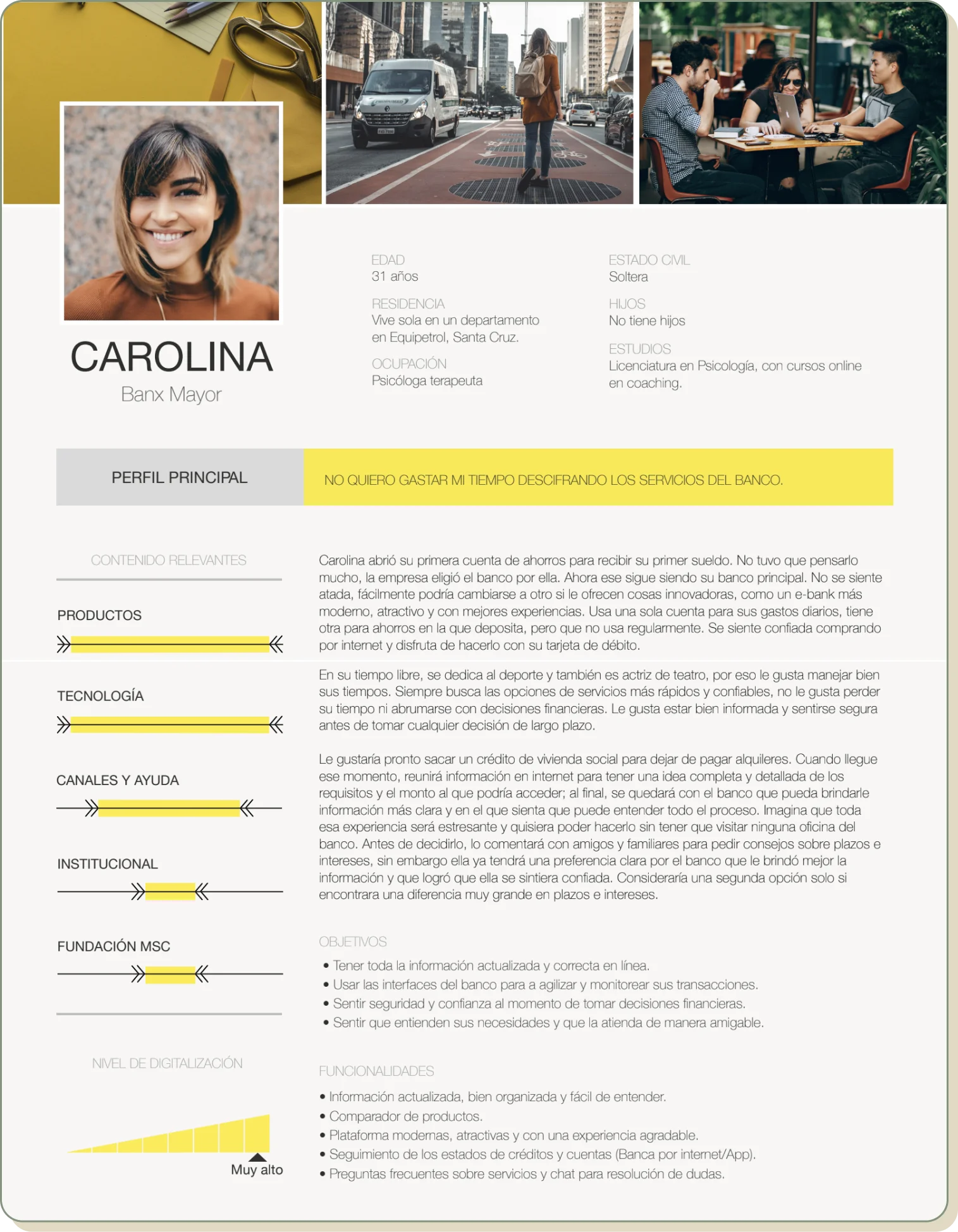
For better alignment with the client, we defined users and agreed on a primary.
We identified our primary user as young individuals aged 25 to 35 seeking financial services. The main persona was developed based on traits and quotes from interviews.
Additionally, we recognized that those aged 35 and above tend to rely more on in-person paperwork and have reservations about online services. However, they occasionally use online tools for information, making them secondary users.
Benchmark
How are other banks dealing with this issues?
The analysis of our local competitors revealed that banks generally do not present information in an easy-to-understand manner. In every case, a grasp of financial terms is required.
Additionally, their style choices lack a distinct personality; they seem generic, attempting to appeal to a broad audience while presenting a multitude of information simultaneously.
The solution
We knew the website goals and user pain points but were uncertain about solutions. With learnings from the Design Sprint, we conducted focused sessions for ideating, seeking inspiration, sketching, and voting on a new homepage structure.
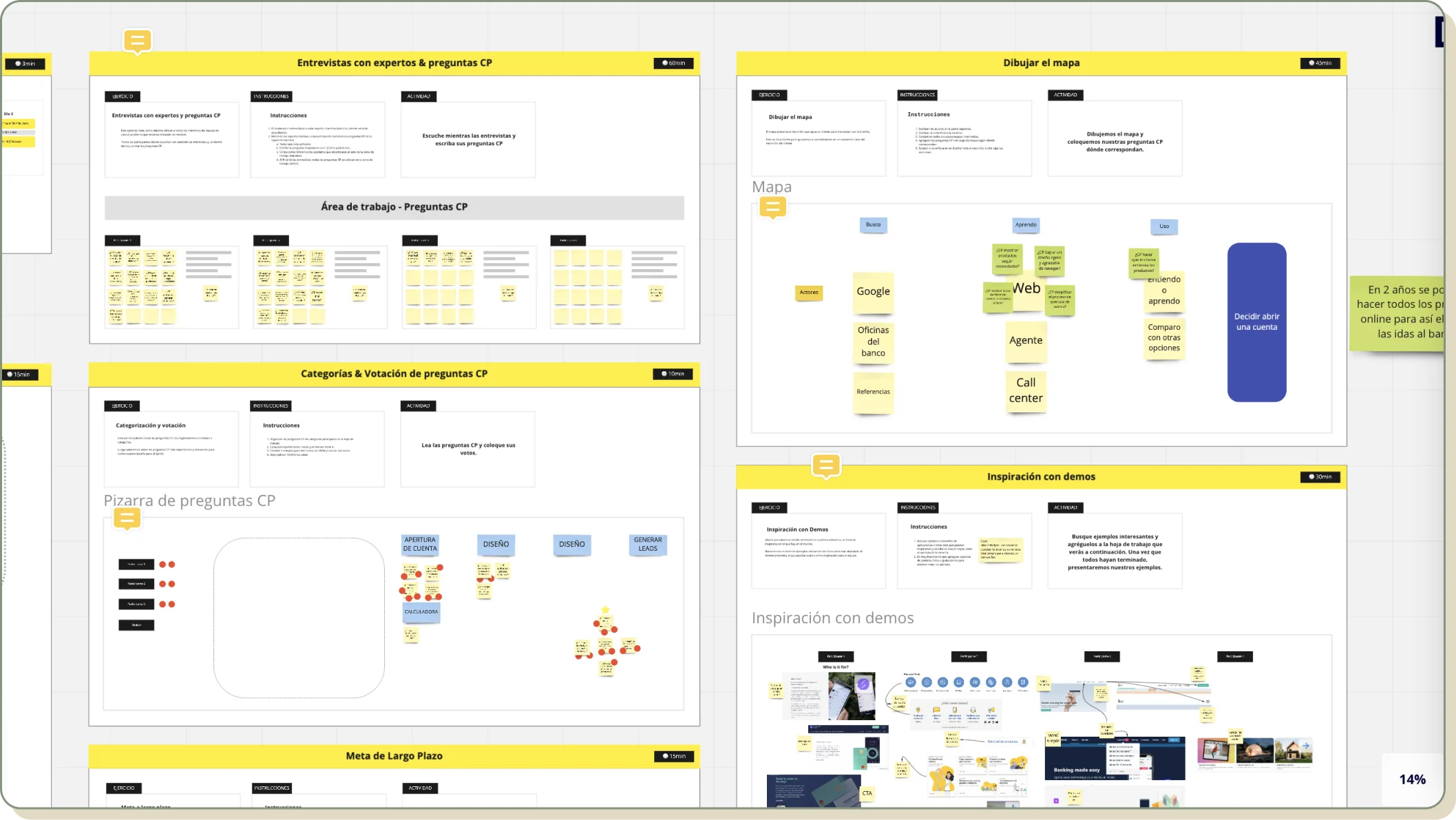
Remote mini-sessions in Miro
Winner solution: Easy finance
After the mini-sessions, we decided to prioritize simplifying complex financial content. We aimed to make navigation concise and clear and summarise the content and use user-friendly language.
Despite the challenge of not finding many UX writers in Bolivia, we trained an advertising copywriter to collaborate on the content’s simplification and restructuring.
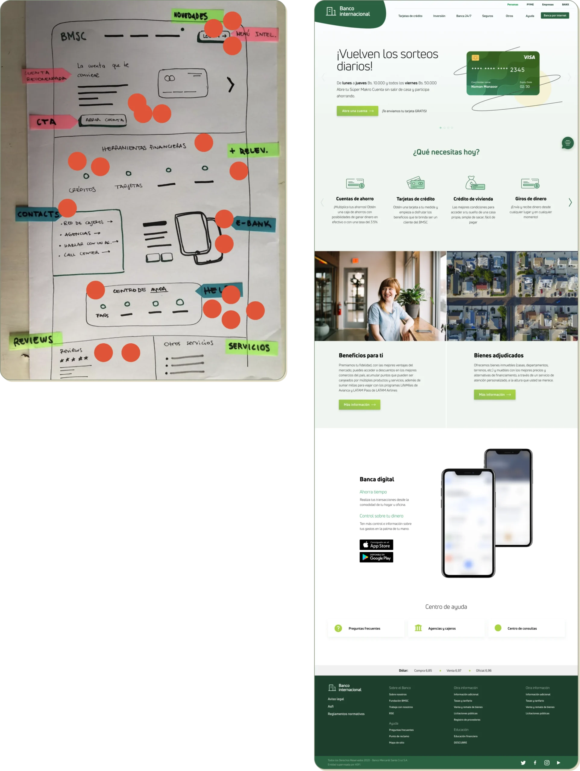
Final designs
I aimed for a light and modern design with softer colors, ample whitespace, and smoothly floating and animating elements. Services were labeled with friendly and clear names and descriptions. We ensured consistent and straightforward CTAs throughout.
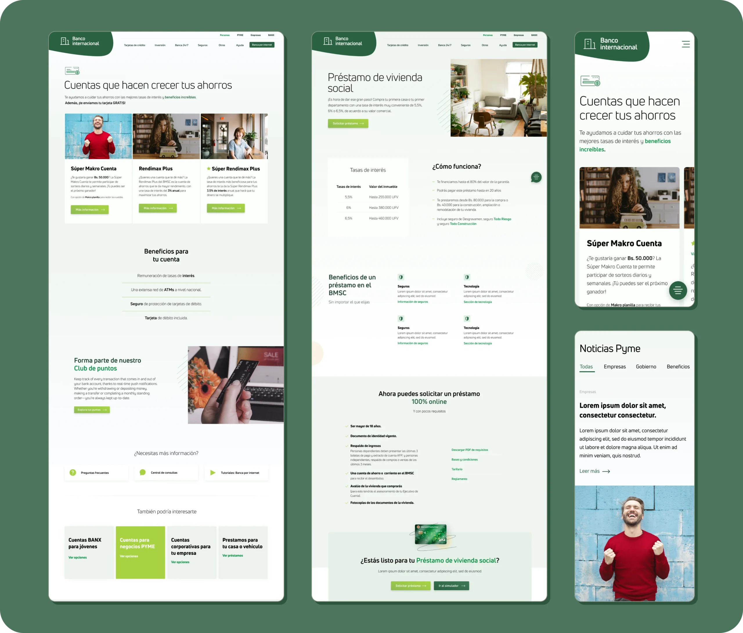
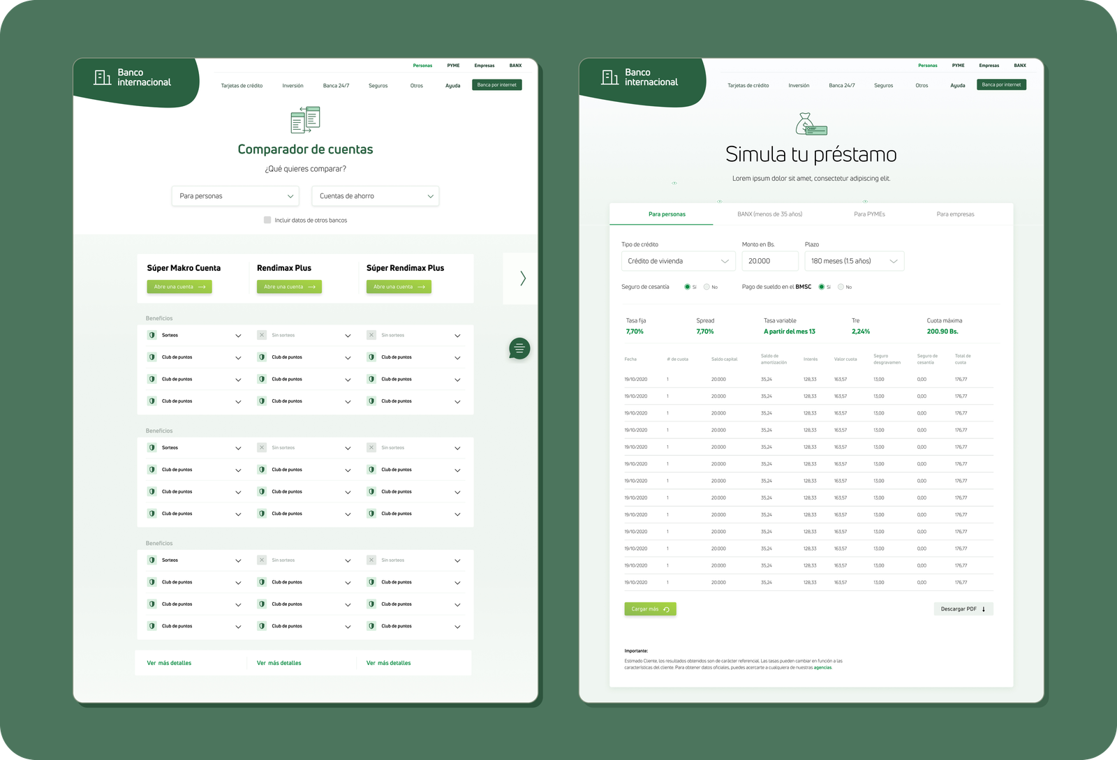
We used tables to facilitate service comparisons, enabling users to discern differences and confidently make decisions.
Additional support resources include FAQs, helpline numbers, a blog covering financial regulations, and general tips.

Learnings and results
Working closely with a UX writer, and from the beggining of the project, is a must for some projects. We learned this the hard way, struggling to find a UX writer mid-project.
User testing following the redesign showed that over 75% of users successfully understood and completed tasks related to obtaining a financial service. This success indicated that we could now focus on constant but small iterations.